Case Study · No. 08
Yelcast
A gallery and studio site for Batangas visual poet Loriel "Yelcast" Castillo, whose paintings carry lines of Tagalog verse in his own hand. Every verse lives on the site as words as well as paint, and the artist runs all of it, inquiries included, from a dashboard built for him.
The situation
Loriel "Yelcast" Castillo is a Batangueño visual poet. Each of his canvases carries a line of Tagalog verse, lettered by hand in tall, dripping capitals over layers of colour. He is a Dangal ng Batangas awardee for the visual arts, represented the Philippines at the XIV Florence Biennale, and showed his Kasinsayan collection at the NCCA in Manila.
There was no single place where a collector could see the paintings together, read the verses, check what was still available, or ask about a piece. And the messages that did come in, through a form or by email, had nowhere to be kept and answered.
What I built
A complete artist site on WordPress and Bricks, with the content modelled in Secure Custom Fields: artworks with their verse, size, framing, authenticity and price, plus awards, exhibitions, FAQs and the artist's own details. The public side has a gallery filtered by technique, a page for every painting with an inquiry form that already knows which piece it is about, a services page, a journal, and the Kasinsayan exhibit catalogue as a page-turning flipbook.
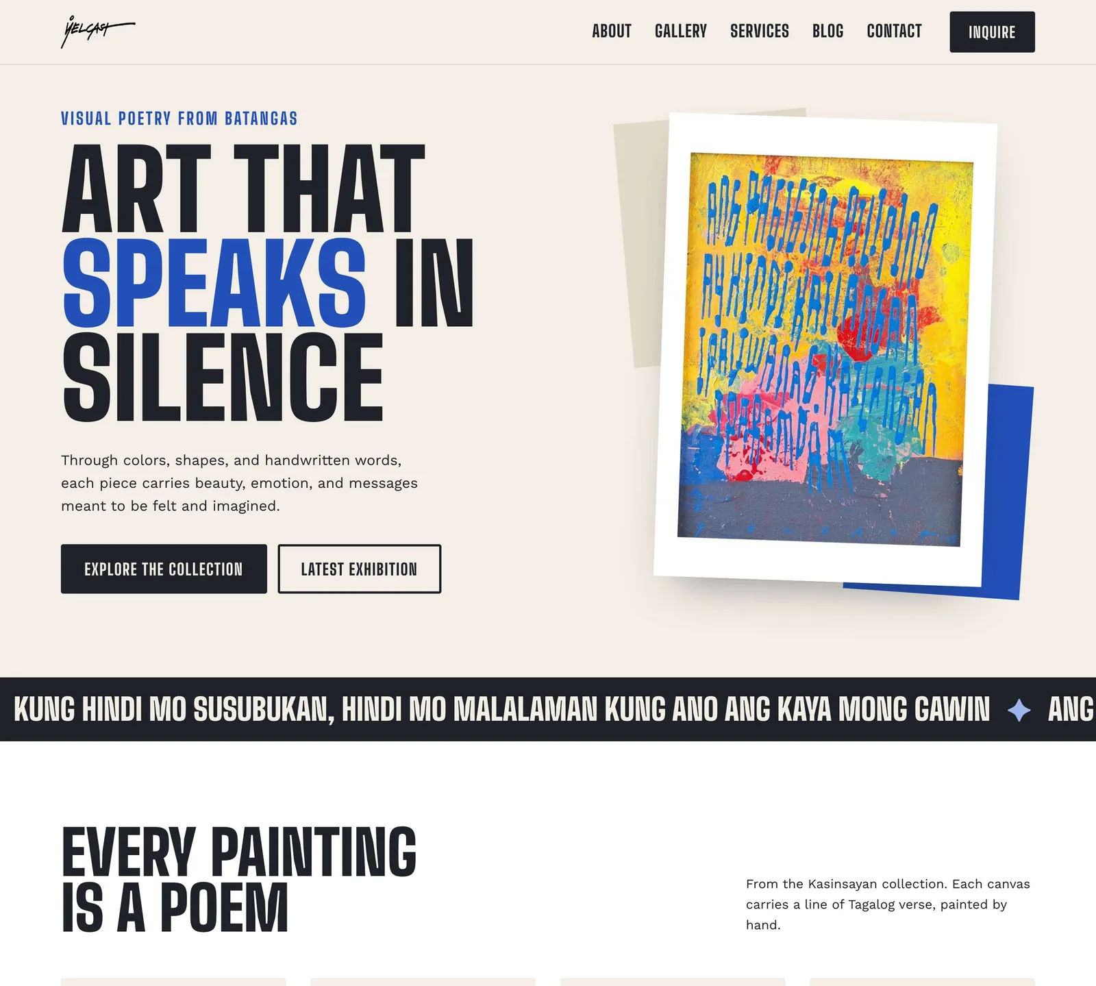
The homepage: the verses run across the page as a slow strip of text, and every painting card below carries its own line.
Yelcast works from a dashboard at its own URL instead of wp-admin: biography, awards, gallery, exhibitions, announcements, articles, FAQs, a QR generator, and an inbox. Every message from the contact form and from each artwork's inquiry form lands in that inbox, and he answers from the same screen. The messages that arrived before the inbox existed were brought in too, so it did not start empty.
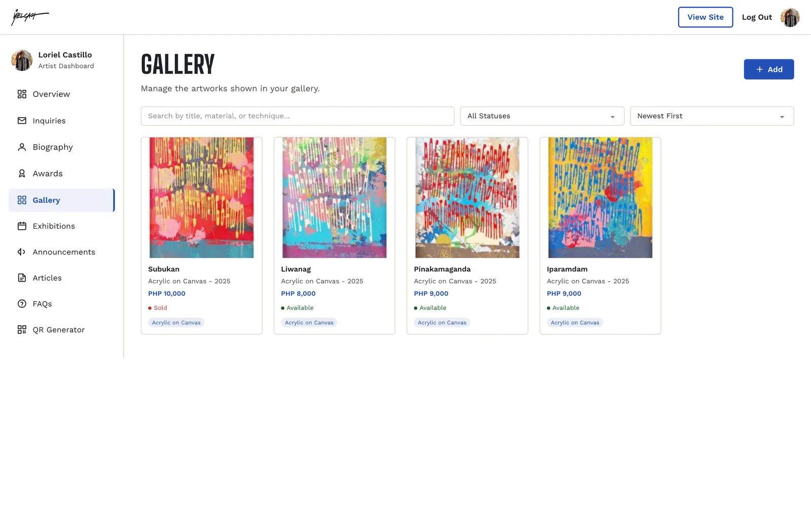
The artist's dashboard, open on the gallery: every painting with its price and status, searchable and sortable, no wp-admin in sight.
In October 2026 the whole site moved to a new design. Three directions were mocked up from his paintings, and he chose a fourth: the layout of the loudest one in the colours of the quietest. Warm paper, deep ink, and the cobalt of his own lettering as the only accent, so the paintings carry all the colour.
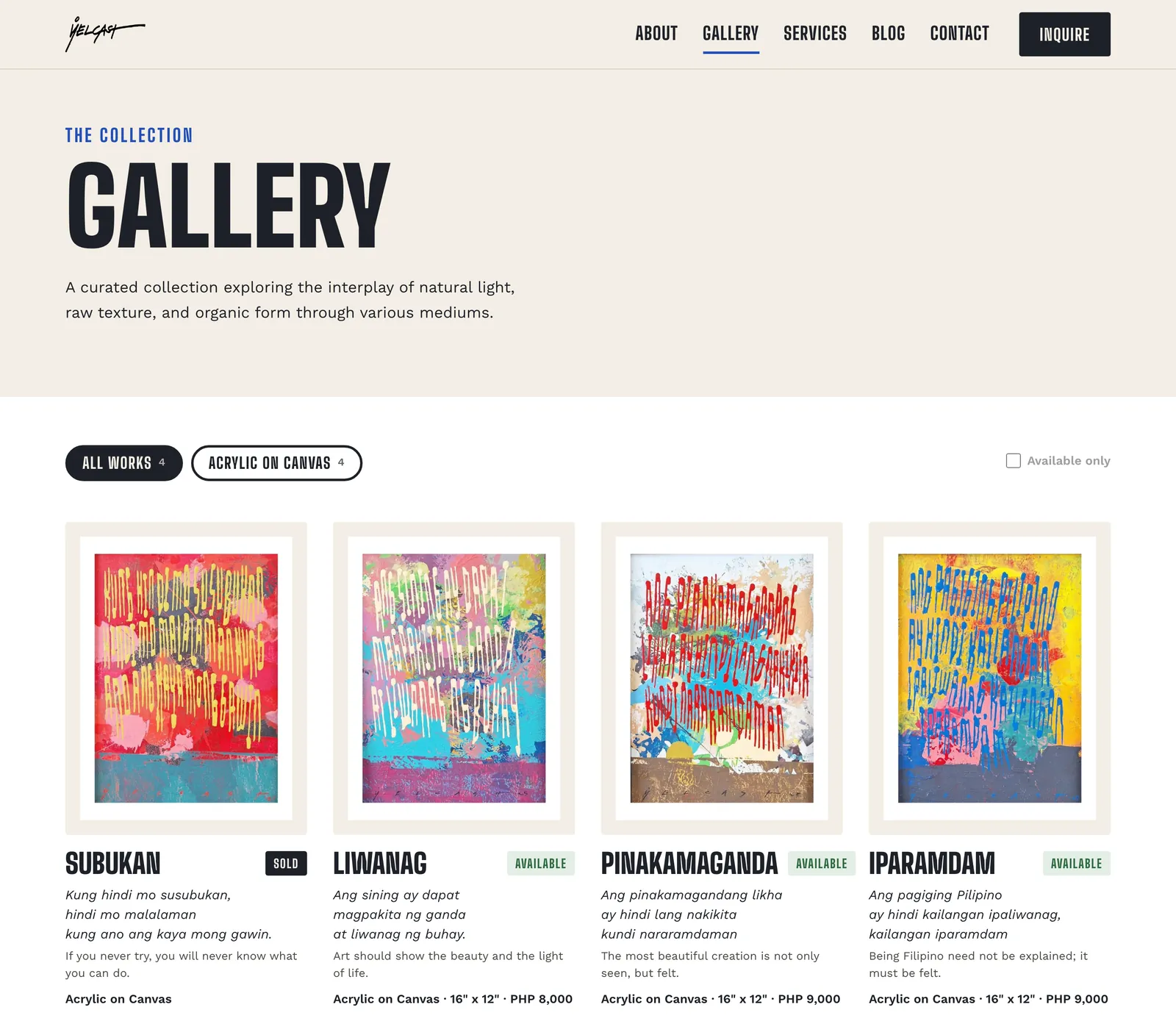
The gallery: filtered by technique, or by what is still available, with the verse, an English line and the price on every card.
A real decision
The inbox reads the studio's mailbox, and leaves it exactly as it was.
When a visitor replies to one of the artist's emails, the reply goes to the studio address, and he still reads that mailbox in his own mail app. An inbox that pulled messages in by marking them read, moving them or deleting them would quietly break the mail he already relies on. So the site only ever looks. Every few minutes it checks for new mail without marking anything, and when a message answers one of his conversations it is added to that thread in the dashboard, which flips back to unread.
Matching is done in order of certainty: first by a hidden reference carried in every email he sends from the dashboard, then by a short reference number in the subject line, and only then by the sender's address, and only for a conversation he has already replied to. Mail that matches nothing is left alone.
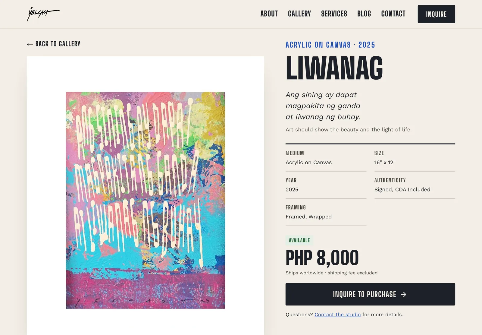
An artwork page: the painting on a white mat, its verse and English line, the details in one table, and the inquiry form a click away.
Decisions that earned their space
The verse is content, not only paint. Each painting's verse is stored as text, with an optional English line beside it. The same words feed the artwork page, the gallery cards and the strip of verses across the homepage, so a new painting adds its line everywhere at once, and the poems can be read, found and shared.
A biography he can edit without HTML. The About page is written as plain text in the dashboard: a blank line starts a new paragraph, the first paragraph becomes the highlighted introduction, and double asterisks make a word bold. The site turns that into the designed page.
A redesign that kept every working part. The new pages were built on the live site behind a preview link, and the pieces that already worked were carried into them instead of being rebuilt: the contact form, each artwork's inquiry popup, the signup form and the catalogue flipbook. Their history and their connection to the inbox came straight across, and visitors saw the complete old site until the moment it switched.
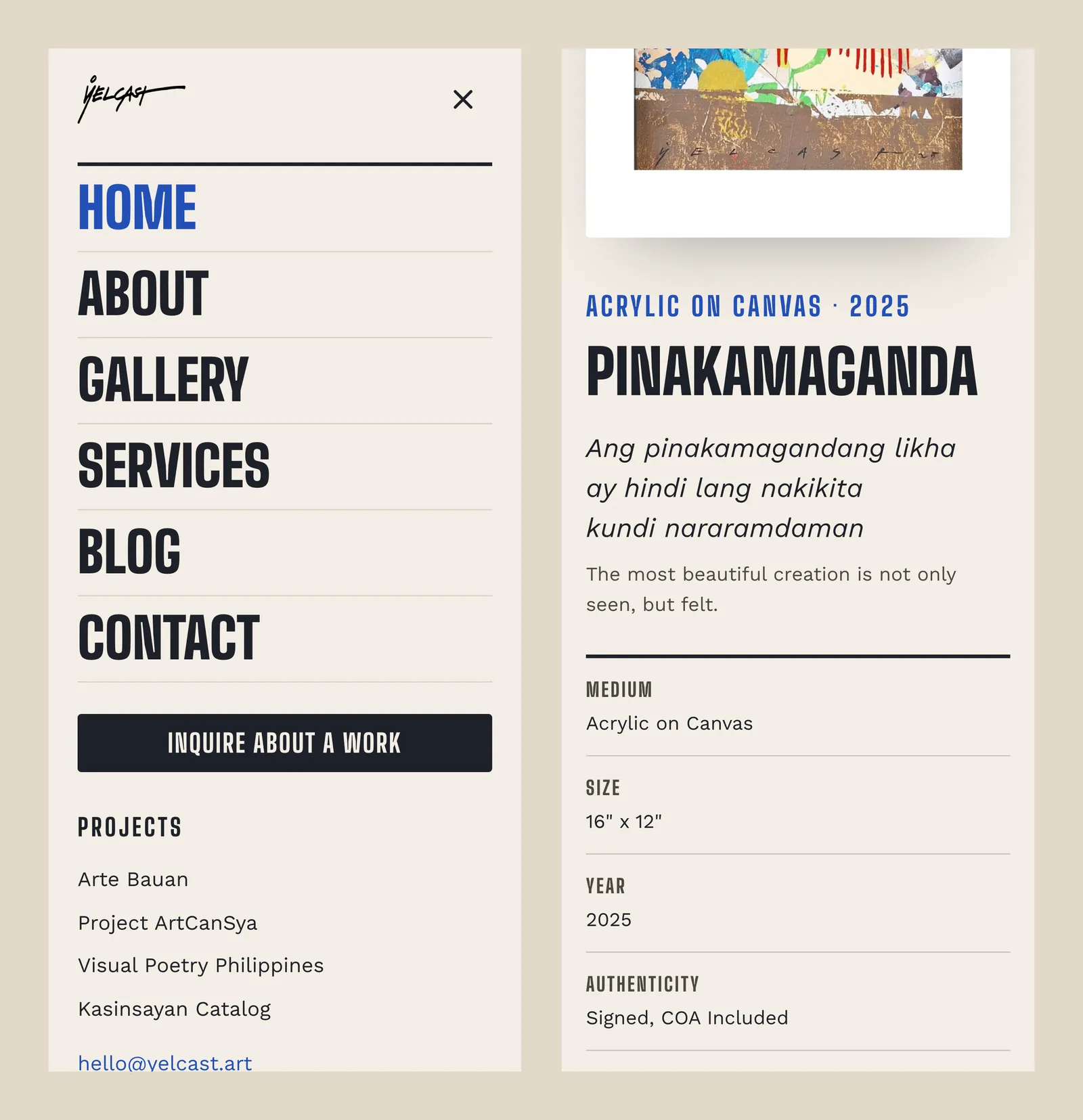
On a phone: the full-screen menu, and an artwork page with the verse and details stacked for reading.
Motion with a reason, and an off switch. On the homepage the painting swings in and settles at a slight tilt, like a canvas being hung, and the rest of the page rises in as you scroll. Visitors who have turned animations off on their device get the whole page at once, with no motion at all.
The outcome
Live at yelcast.art with the paintings, their verses, prices and availability, the Kasinsayan catalogue, and every form feeding one inbox that the artist answers from his own dashboard. The whole site, from the homepage to the legal pages, moved to the new design through a single switch, with the previous version kept as a backup.
The collection online is still small, so this is a story about the system rather than the numbers, and the system is ready: adding the next painting, with its verse, is one form in his dashboard.
Tech stack
Need something like this built?
Tell me what your operation actually does all day, and I'll tell you honestly what's worth building. No jargon, no "let's circle back."