Case Study · No. 07
Remoism
A gallery and studio site for Batangas visual artist Remo Valenton, where each of a hundred works has its own priced page, the artist runs everything himself from a dashboard built for him, and no image is ever bigger than the space it fills.
The situation
Remo Valenton is a Batangueño visual artist whose work began in the student protest years of the late 1960s and 1970s, and the creator of REMOISM, his own form of process-based assemblage built from upcycled GI sheets, found objects and vivid colour. The work had a following and no home of its own online: nowhere a collector could see the pieces together, check a price, or ask about one.
The site also had to be his to run. An artist adding a new piece, updating a biography or posting an exhibition should not have to learn wp-admin, and should not have to wait on a developer each time.
What I built
A complete artist site on WordPress and Bricks, with the content modelled in Secure Custom Fields: artworks, exhibitions, achievements, memberships and announcements as their own types, and the biography as an options page. The public side carries a filterable gallery of 100 works, a page for every piece with its price shown only when one is set, an inquiry form that names the exact artwork it came from, a long-form page on what REMOISM is, and the artist's biography and record.
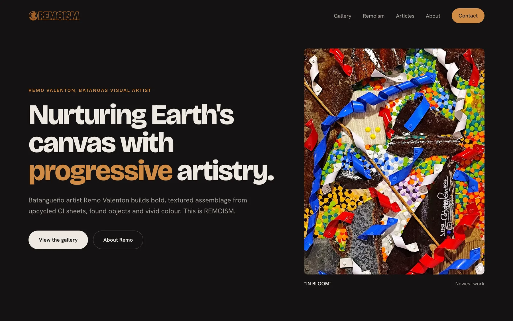
The homepage in Dark Studio: the newest work beside the headline, then one row of selected works.
Remo works from a dashboard at its own URL instead of wp-admin: overview, biography, achievements, gallery, exhibitions, membership, announcements, articles and a QR generator. The articles panel writes straight to native WordPress posts, so anything he publishes there appears on the public journal at once, and anything already in WordPress shows up in his dashboard.
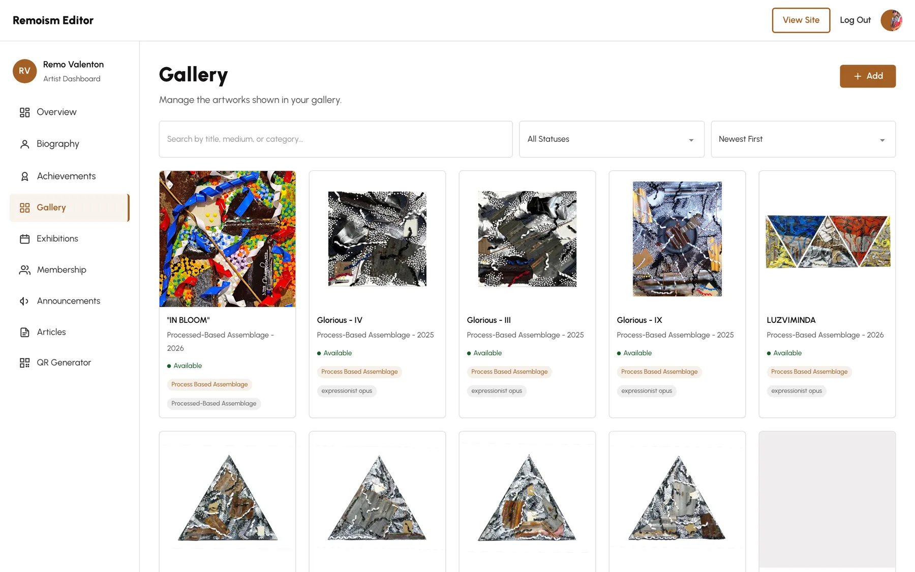
The artist's dashboard, open on the gallery: every work with its status and categories, searchable and sortable, no wp-admin in sight.
In October 2026 the whole public site moved to a new look, Dark Studio: charcoal walls, bone-white type, and the amber of his logo as the only accent, so the colour in the artworks carries every page.
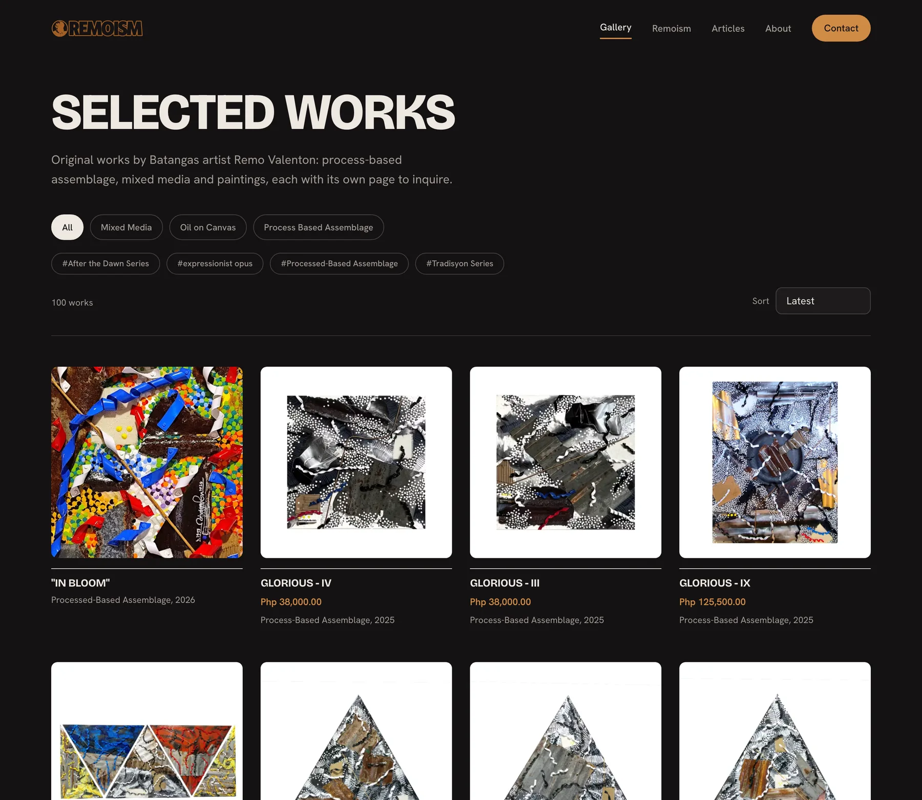
The gallery: 100 works, filtered by medium or series, each card showing a price only when it has one.
A real decision
Every resized image on the site is AVIF, and every original stays exactly as it was uploaded.
Converting the originals was the obvious move and the wrong one. Facebook and Messenger link previews do not accept AVIF, so a shared artwork link would arrive without its picture, on a site whose job is selling the work. The originals are also the artist's master copies of his paintings, and older links point straight at them. So the originals stay, and every copy WordPress makes from them, at every size, is written as AVIF, new uploads included.
This server's ImageMagick ignores the AVIF quality setting, so encoding goes through GD at a quality chosen by comparing crops side by side, after ImageMagick has done the resize and converted photos shot on an iPhone in Display P3 into standard sRGB so their colours do not go flat. Each slot on a page then asks for the size it actually shows. The photo at the top of the homepage went from a 3.3 MB JPEG to a 306 KB AVIF, and a typical artwork card from 759 KB to 96 KB.
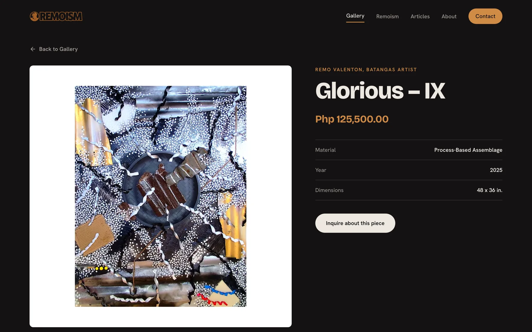
An artwork page: the price leads, the details sit in one list, and the inquiry form knows which piece it is about.
Decisions that earned their space
A redesign nobody saw half-finished. The new look was built on the live site behind a preview switch. New page content sat in parallel fields and was swapped in only for a preview link, so visitors kept seeing the complete old site until the moment it changed, and every old page was backed up before the switch.
A price that appears only when there is one. Price is an optional field on each artwork. The artwork page, the gallery cards and the structured data all leave it out when it is empty, so an unpriced piece never shows a blank or a zero. Sixty prices came in from the artist's own spreadsheet, matched to the site title by title.
An inquiry form built for a phone. On mobile it opens as a bottom sheet: the artwork and the close button are pinned at the top, Send is pinned at the bottom, and only the fields scroll between them. It does not throw up the keyboard on open, and the inputs stay at 16px so the phone never zooms in.
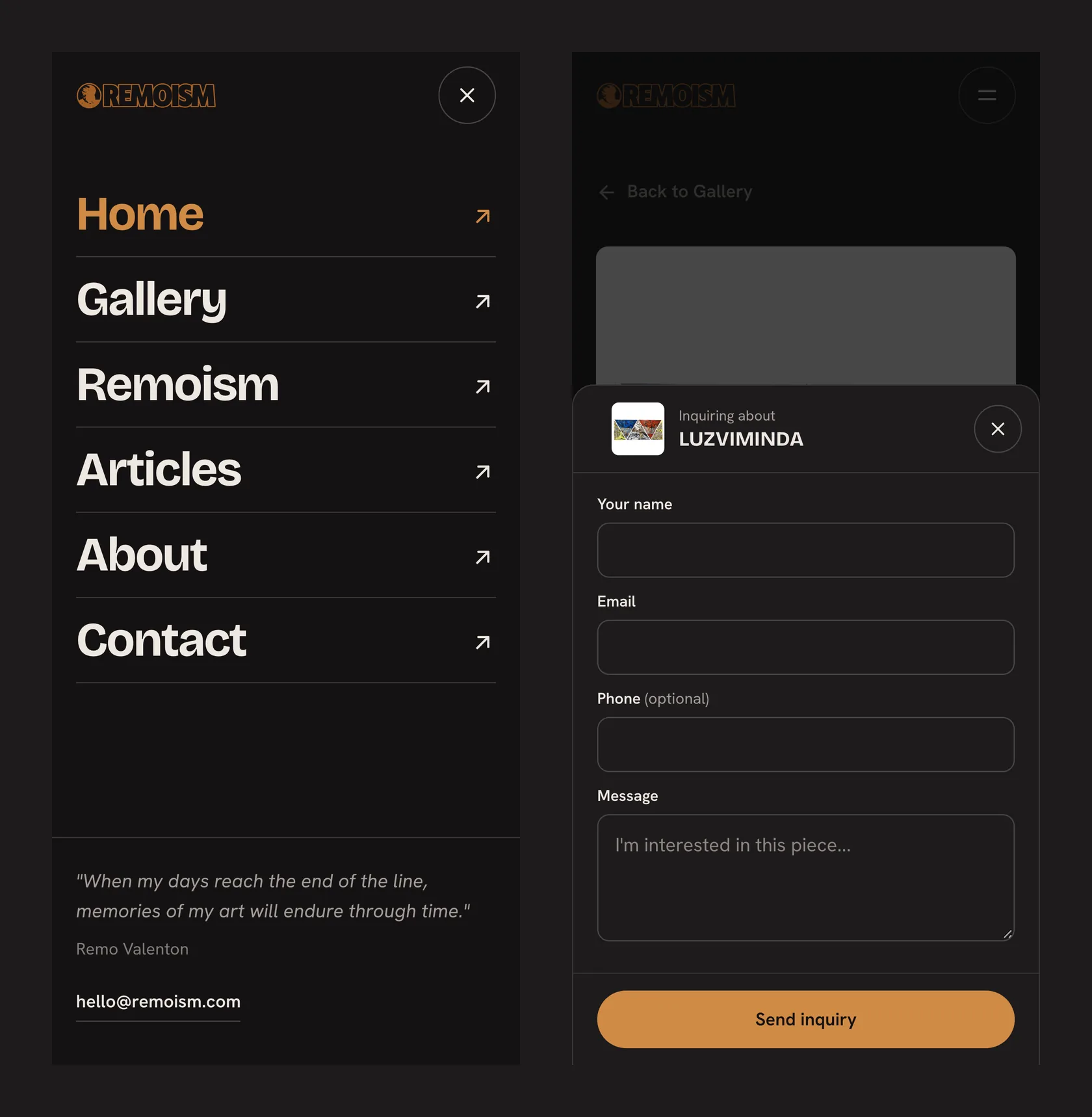
On a phone: the full-screen menu, and the inquiry form as a bottom sheet with Send always in reach.
Found by the people looking for a Batangas artist. Each page names the artist and the place in its title and main heading, Google gets a structured profile of Remo, his memberships and his award, and every artwork is marked up as an original work with its price and availability. Thin record pages stay out of the index, so the sitemap lists only the pages worth finding.
The outcome
Live at remoism.com with 100 works in the gallery, 60 of them priced, each on its own page with an inquiry form. Remo adds and edits his work from his own dashboard, new uploads become right-sized AVIF on their own, and the redesign went live for everyone in a single switch.
Search rankings take weeks to move, so the search story is still being written. Everything it depends on is in place.
Tech stack
Need something like this built?
Tell me what your operation actually does all day, and I'll tell you honestly what's worth building. No jargon, no "let's circle back."